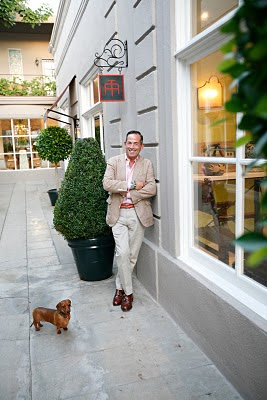
He had been looking for a small space in New York, with huge views and after some searching he found the ideal space in a new glass tower not far from his eponymous showroom on East 59th street. (below)

The studio has 600 square -foot. Being used to grand commissions and living in a 2,000 square -foot home in Los Angeles he felt this was a welcoming challenge.
In his own words: "Good design is about editing. You can live very well in one room."
The room we are talking about is a bright space high above the city with a view to die for.
Being bright all day it becomes a sparkling jewel box at night. The city is a glittering sea beneath his eagle's nest.
His major inspiration for setting up his small space was Billy Baldwin. Baldwin was a master of the mix, a modernist, who despised clutter, believed that function should define form, and was unafraid to use bold colors in all kinds of ways.His work included Cole Porter's famous tortoiseshell library room and Diane Vreeland's equally celebrated Chinese - red living room.
Romano 's midnight blue color on the walls has a lacquered finish, "It makes the structure recede, so the space feels bigger." he explains.
All furniture is hand picked, for most visual impact and functionality.

He designed the large sectional, which also doubles as his bed. Choosing a dark blue velvet works with the walls, making it feel seamless.
A small Louis XV -style voyeuse from Frederic P.Victoria & Son faces the window on top of a large zebra -skin rug.
(A voyeuse is a chair designed for sitting astride back-to-front with the top of the back padded for the occupant to lean on)


This modern box had not much to offer when it came to architecture, therefore thoughtful design became truly important.

He mixed a Chinese red and green vase based lamp on top of a French glass dining table with green velvet chairs and a mid -century Ward Benett chrome and wicker sled chair sits near by. The artwork is graphic and strong, focusing on shapes and colors. Across the room resides a magnificent Louis XVI -style commode.

He mixed a Chinese red and green vase based lamp on top of a French glass dining table with green velvet chairs and a mid -century Ward Benett chrome and wicker sled chair sits near by. The artwork is graphic and strong, focusing on shapes and colors. Across the room resides a magnificent Louis XVI -style commode.
It's a happy mix, pulled together by choice of color, form, wonderful artworks and Romano's great sense for an eclectic approach to decorating.
Some of his furniture migrated from his former New York apartments, his showrooms in the city and in Los Angeles. He just opened a second showroom on La Cienega Boulevard in West Hollywood.
I have been missing such stronger color statements lately! I welcome his courage and boldness!
A happy weekend to you!
Victoria
Pictures via Architectural Digest 2/11 and as indicated.


love it! love the blue and the bold statement.
ReplyDeletepve
Beautiful, beautiful interiors that stir the soul! Hope you are well Victoria and have a wonderful week-end.
ReplyDeletebest wishes
Frances
GOOD MORNING VICTORIA DEAR! Thank you sweet one for your kind comments. This too, shall pass. The darkness, the empty thoughts, the fatigue. I am sure that giants like Tony Romano as well have experienced moments of EMPTINESS but look at the results of reflection, DETERMINATION and time....what gorgeous creations!!!! I LOVE THE BLUE SECTIONAL SOFA! Rich colors such as these make my head turn for a bit away from my WHITE and GRAY and turquoise tendancies!!!!
ReplyDeleteHow are you spending your weekend? ENJOY IT ALL!!! Anita
I just realise I have been missing your posts! Something amiss on my side of things I think. I love that rich, dark blue colour. Stunning! Have a great weekend.
ReplyDeleteHow fabulous! I need to pick up a copy! Great post!
ReplyDeleteJust when I had given up on AD, you show me this. Love the peacock blue walls and those french chairs covered in green velvet...ahhh! I passed a litlle bloggy award to you!
ReplyDeletePatricia, Thank you, I was so taken by that gorgeous blue!
ReplyDeleteFrances: I should live in a castle to be able to bring all my design fantasies to live.... white walls, light floors, dark walls, dark floors, monochromatic, eclectic.....
Anita: I so love your kind words and believe me, I know about the dark moments too!
Lois: Oh, I am glad you came over!
Sue:Thank you! I am so glad you like it!
Rebecca: I had this feeling on and off with AD, not sure if I really love them, but they have their moments....
And thank you for this award, I am thrilled!
Hi all,
ReplyDeleteThanks for the great post ... i really found it interesting.
House Extension Design